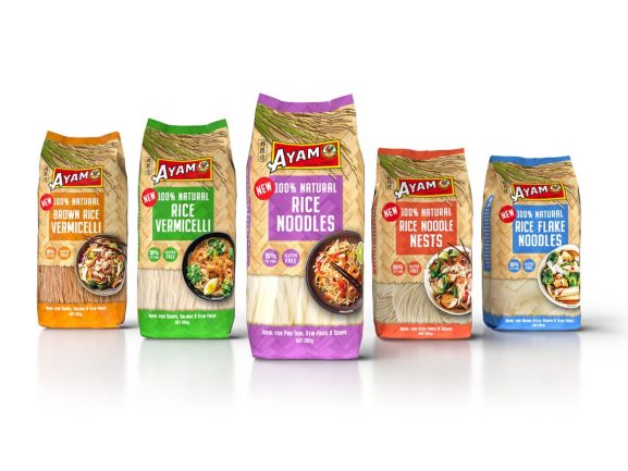
Ayam, an Asian cuisine company, was seeking to highlight the 100 per cent natural ingredients in its Dry Noodle range. With flavour at the core of every Ayam product, it partnered with Sydney-based Tweak Design to come up with a label design that emphasises a strong appetite appeal.
Tweak conducted a category review to identify the competitive landscape and assess potential market gaps. This analysis led to the development of a positioning strategy, which formed the foundation of the design solution. The strategy also ensured that the design remains aligned with the overall strategic objectives.
“Leveraging the Ayam brandmark is crucial for establishing the product’s relevance within the category. To achieve this, the brandmark is prominently displayed, while bold, eye-catching variant colours contrast with the natural background tones,” Tweak Design senior graphic designer Shane King said.
“A woven bamboo texture ties the products together, creating strong range blocking on the shelf. Enticing recipe photography enhances the design, engaging consumers with strong appetite appeal.
“Our design incorporates natural textures, organic shapes, and photography, emphasising the product’s natural authentic appeal.”
Throughout the design and artwork phases, a series of tests were performed to ensure the final product aligned with the original vision.
This included colour-accurate digital 3D renders of the packaging and in-situ shelf views during the design stage. In the artwork stage, colour target proofs guided printers to ensure the final print is accurate.
Printing was done offshore using a laminated printing method.
“To build a genuine connection with consumers, it’s essential to be transparent about your offering. Highlighting the key positive attributes of both your brand and product is the first step in establishing a meaningful and authentic connection. Significant effort goes into developing quality products, and it’s the packaging’s role to effectively communicate this value to consumers,” King added.


