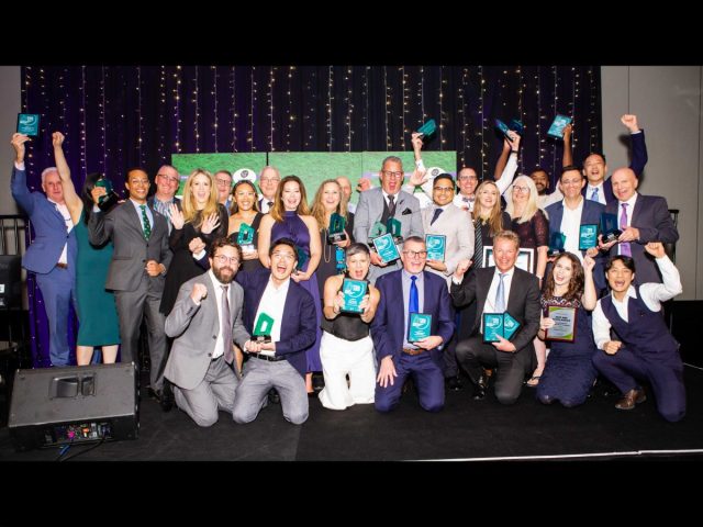
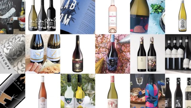
The judging panel of the 2023 Packwine Design Awards have selected winners in six categories out of nearly 100 entries. Hundreds of votes from the public have also been tallied to reveal the winner of the National Wine Centre of Australia’s People’s Choice Award.
Packwine is presented by Winetitles Media in association with the Australian Institute of Packaging (AIP), the Australian Wine Research Institute, Wine Industry Suppliers Association, Australian Packaging Covenant Organisation (APCO), Australian Grape & Wine and The University of Adelaide.
Grapegrower & Winermaker editor Hans Mick said, “Thank you to the many wine companies and design studios which entered this year’s awards and promoted the entries through their networks. Just as in previous years, the popularity of the Packwine Design Awards is again evident by the large number of entries received from across Australia and New Zealand.
“The nearly 100 contenders represented the range of packaging styles, from a classic to more contemporary design on traditional 750 millilitres glass bottles through to various non-glass alternatives.
“Once again, we have received hundreds of votes from the public for the People’s Chice Award. I would also like to thank our judges for their time in evaluating each entry. Each judge brought industry experience and expertise to the awards, and I am grateful for their involvement.”
The judges panel included Nerida Kelton, executive director of the AIP; Eric Wikes, general manager of Affinity Labs and Australian Wine Research Institute; Peter Muscet, editor of Wine Showcase magazine; Chris Williams, sales and marketing manager at Jamesprint and emeritus professor of wine marketing at the University of South Australia, Larry Lockshin.
The winners are as follows:
Best Luxury Design Award – Mission Estate Huchet by Sartoria
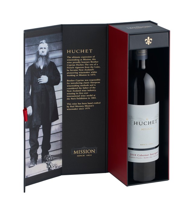
Designed by Sara Fraser from Sartoria, the packaging is an embodiment of the heart and depth of the bold wine. Gold foil was used to set the regal atmosphere of the wine, emphasised with pearlescent foil wings to catch the light in an ethereal way. A premium foiled single bottle gift box accompanies the wine packaging at the point of sale.
The minimal colour palette reflects the French origins of Brother Cyprian Huchet with red, white and blue. The message ‘Since 1851’ features on the tin capsule, emphasising the heritage of the winery. Typography was kept “elegant and minimalist” to ensure the embellishments and heritage stood proudly in “a contemporary expression that will remain timeless for many years to come.”
The judges commented, “Clean and elegant. The design highlights the brand with an attention to detail in the embossing and gold foil.”
Classic Format Package Design Awards – Splitpants Productions for The Wayward Girl of Fernfield Wines

Fernfield Wines co-owner Rebecca Barr said, “We loved the idea of using paintings for the wine label. The painting idea really goes well with the old-fashioned nature of the cottage [and] the history of the cottage. From brand colours that tie in with the cellar door scenery to reoccurring emblems of vines and fern fronds, bring everything together”.
The Wayward Girl is inspired by the cottage at Fernfield Wines’ cellar door. Built in 1856, the cottage was used as a home for ‘wayward’ city girls. Each vintage, Fernfield aim to commission a different artist to produce an interpretation of a wayward girl. This year’s artist was graphic designer and painter Amy Herman.
The judges commented, “A unique and eye-catching design on the retail shelf that build the brand’s image”.
Best Package Series Design Award – Drury Lane Estate Wines
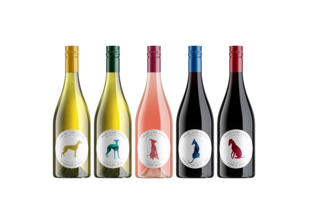
The silhouette of the dog that appears on the Drury Lane label is a nod to co-founder Alexandra Scott’s heritage as it was featured on the family crest for Drury, her maiden name.
“The other benefit of the dog is [that] just a simple change of the dog’s pose distinguishes differences in the varietal,” Scott said.
“We were looking for a scalable package design that would be able grow with us as our brand and product offerings increased over time, but that would be distinct enough to easily be able to discern one varietal from the next.
“The dog’s pose was also matched with the varietal as best we could. The puppy-shaped pink dog was placed on the rosé as it was more likely to appeal to a female audience, who are the primary drinkers of that varietal.
“The other key differential with our label in the otherwise very saturated wine market, was the colours we used. Our brand values and subsequently our labels are all about daring to be different and standing out in a crowd, something that the striking colours on the packaging are intended to reflect.”
The judges commented, “A whimsical but high-quality label, it easily identifies the brand and all of its variants.”
Best Package Redesign – Design Energy for Alexander Hill wines range
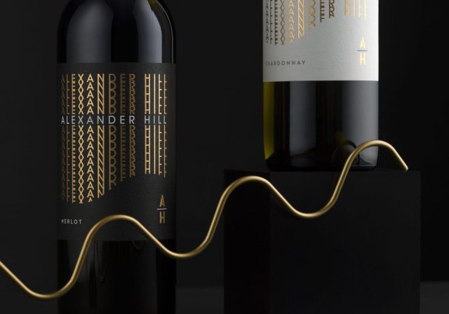
Redesigning a label can be challenging when the brief is limited to typography, but Design Energy aimed to incorporate storytelling in its design.
Design Energy creative director Trish Dunstone said, “We implemented the actual hill into the base of the label, which is something that’s not immediately obvious. We love those thoughts, where the consumer all of a sudden goes, ‘Oh, I see what they’ve done’.
“We worked with the name in a much more contemporary and modern way without [it] looking like the same old vineyard label from yesteryear.”
The judges commented, “A very modern update of a traditional looking label that maintains brand identity with luxury touches while opening the brand to new consumers.”
Best Alternative Format Design Awards – Blaq Jaq Design for Greenskin wine medley pack

Greenskin Wine focused on three key elements when developing their brand: the quality of the wine, the practicality of the pouch and the sustainability of the packaging. The pouch is compact, lightweight, tough and chills quickly.
Greenskin co-owner Kim McKee said, “People love it because they want to drink good wine and bottles are a pest. The most important thing to understand the sustainability of these pouches is that they take so little energy to produce compared to glass – less than 20 per cent. A truckload of empty pouches is the equivalent of 26 truckloads of empty bottles.
“Whenever we send out full pouches, they are still 60 per cent of the weight and the space of glass bottles. That’s the real sustainability win – in that there’s the energy saved by using them.”
The judges commented, ”An innovative six-pack box of sustainably packed wines from Western Australia.”
Best Presentation and Gift Pack Design – Vivid Creative for The W giftset design
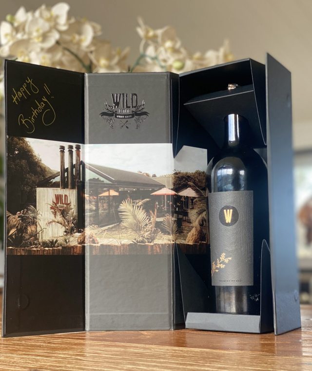
Drury Lane Estate said, “The design for ‘The W’ aimed for subtle style over loud and bright designs and incorporates a dragon skin effect to the tactile label not only the look, but also the textures.
“The design was to replicate our shou sugi ban; a modern feature on our new restaurant building, where the wood is burned, creating a rippled dragon skin effect. The design had to be outstanding, using the best materials we could find.
“Our design is modern and contemporary using the very best materials – whilst it would have been easy to have just our logo embossed on a luxury box, we decided to replicate the features of the lovely bottle label. Our design on all our branding is all about being draped around, off-centre, and partially covered. We use the very best paper stock, we foiled, we pressed the dragon skin and we glossed.”
In addition, the National Wine Centre of Australia’s People’s Choice Award went to Blaq Jaq Design for Greenskin wine medley pack.