This article was written by Grant Davidson, founding partner and head of strategy at Davidson Branding and was first published on Davidson Branding.
First launched in New York City in 1979, Absolut Vodka has become a staple not just for its delectable alcohol but also its unique approach to packaging and advertising.
A true disruptor in the sector; its refreshed bottle design masterfully pays homage to its Swedish origins, not compromising the originality characterising the brand and the forwardness in which it communicates its values.
The simple yet impactful limited-edition designs creatively encourage collectability whilst making bold statements; the iconic clear bottle used as a medium that communicates and promotes inclusivity and acceptance through art.
Focusing on consistently communicating the tradition and provenance of the product – from seed to bottle – reassures consumers that Absolut Vodka has remained as high quality as sustainable in its approach throughout the years; its core values never-changing.
Always in the pursuit of perfection, the brand decided to transform its bottle shape despite being well-loved for generations. Whilst quite risky, the selected group of creatives ensured that the new bottle remained recognisable and encapsulated everything the brand claims to be – original, creative and bold.
By featuring an elegant, hand-drawn expression, the vodka brand remains true to its Swedish roots; nodding to the provenance, care and craft of Absolut’s One Source, One Community brand story.
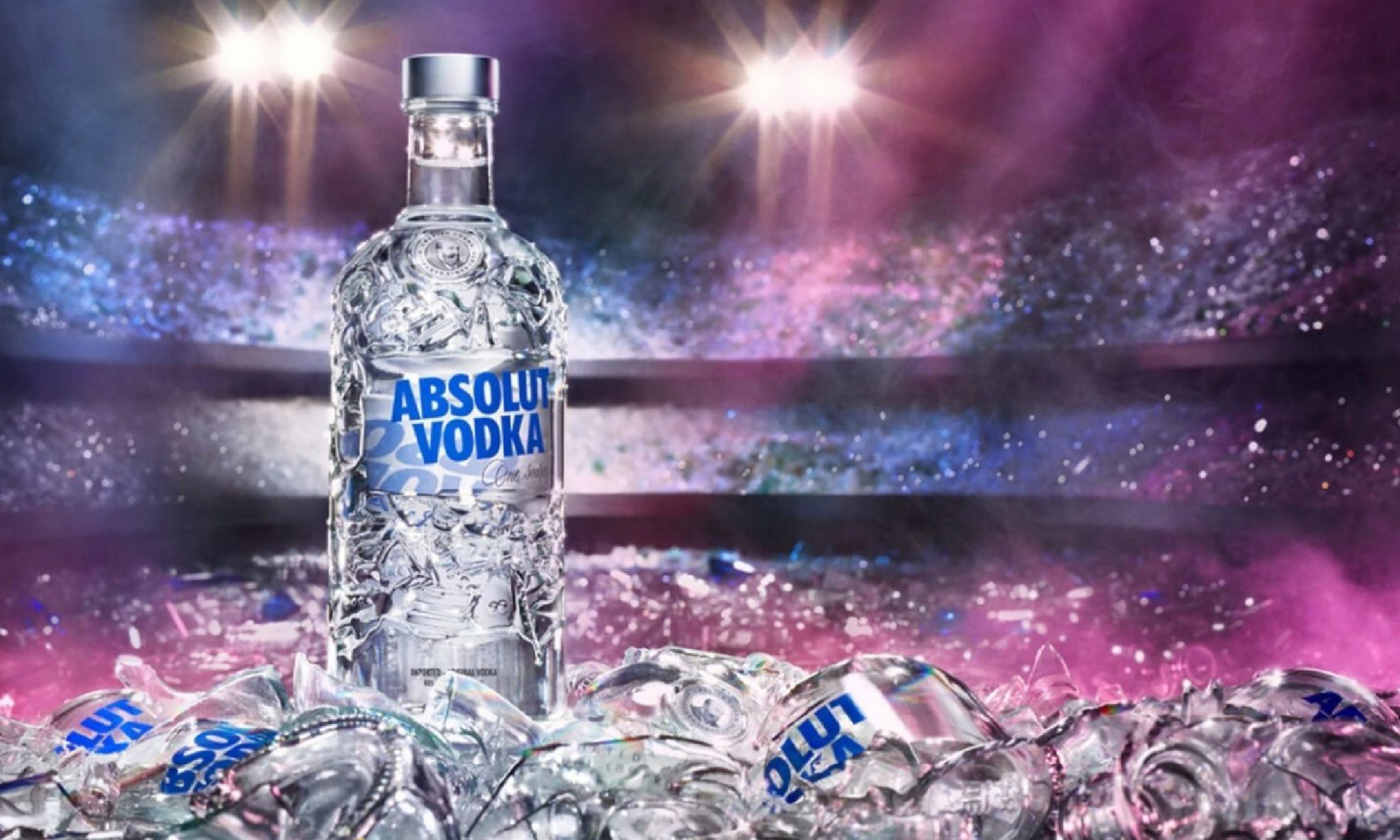
The Absolut Vodka packaging refresh masterfully places the brand in an advantageous position to “face the future by further renewing its creative expression”.
Ever since its collaboration with Andy Warhol, who created the famous print campaign in the 80s, Absolut Vodka has used its branded communications uniquely. Unlike its competitors, who primarily use traditional ads, Absolut Vodka’s strategy relies on promoting artistic interpretations of the iconic vodka bottle; cleverly setting the brand apart in the market and further capturing the consumer’s eye.
Taking on the unique shape of an 18th-century medicine flask found in an antique store in Stockholm, the pack form itself is a branded icon. The heritage seal features an illustration of L.O. Smith, the man behind the pursuit of making absolute pure vodka; its inclusion symbolising the high-quality of the alcohol contained inside and referencing the history of how the production of vodka has been passed down from generation to generation.
A challenger of the sector’s status quo, Absolut further disrupts the category by avoiding formulaic labels that feature ingredient cameos, adopting instead unconventional ones that capture the essence of flavour through art.
The striking designs allow the brand to stand out on shelf and immediately communicate the energy and vibrancy characterising Absolut Vodka. The purity of the bottle design not only reflects the authenticity of the product but also offers flexibility in allowing the brand to collaborate with various artists and easily expand its range; making Absolut Vodka a desirable collectors’ item.