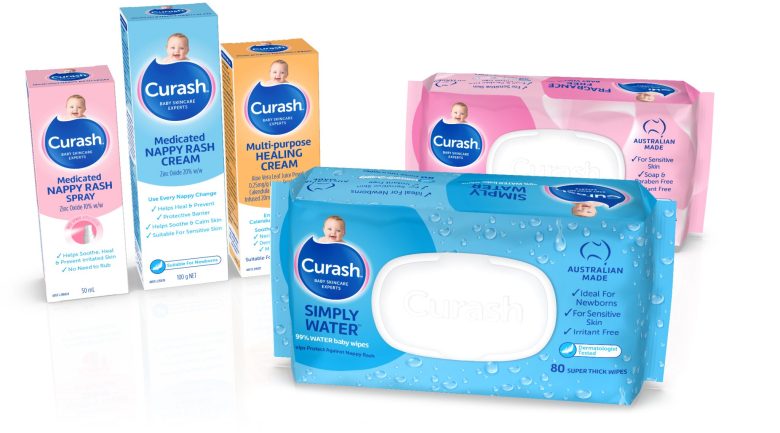
Curash has launched a new design for its packaging, with the company saying the refresh modernises its look to stand out in a crowded market.
The company teamed up with Sydney creative studio Tweak, which developed the redesign.
“The trusted Curash brand and packaging needed to be modernised to help it stand out in a crowded market,” Curash said.
“Tweak evolved the logo shape which dovetails around the smiling baby face and added the tagline ‘baby skincare experts’ to reinforce the brand’s credentials.
“A new pack architecture, rounded, softer typography ensures easy shelf navigation and helps new parents navigate the baby care category with confidence.”


